
My Role
Product Designer (Lead)
Services
Dashboard Design, IA, Onboarding
Timeline
4 weeks
Scope
Research, Design, Visuals, Mentorship
Problem Statement
User Personas
User Persona
Preference
1.
Modern tech savvy retail merchants
Prefers self serve
2.
Moderate tech savvy retail merchants
Prefers telecalling assistance, FoS if needed, but can do self serve if nudged
3.
Traditional retail merchant with low tech savviness
FoS visits the merchants first
4.
Mid Market & Enterprise merchants
Dedicated account managers
5.
Exisiting RZP merchants looking for offline solutions
Are tech savvy, familiar with Razorpay process & offerings
From a larger lens, we clearly needed to solve for both telecalling assistance, FoS & self serve. But solving one problem at a time, for this project, we narrowed the scope to self serve.
Traits of the above target persona
Tech-savvy users prefer self-serve due to their familiarity & trust in Razorpay as an online payments leader.
They recognize the benefits of omnichannel payments when signing up with Razorpay.
Comfortable with self-serve onboarding, they are patient with the process and willing to provide business details online.
Unlike traditional buyers, they don’t require face-to-face assurance before purchasing. This persona highlights the ideal user for a frictionless, digital-first POS acquisition journey.
All the above reasons make persona 1, 2 & 5 the best suited for our MVP to test out our product.
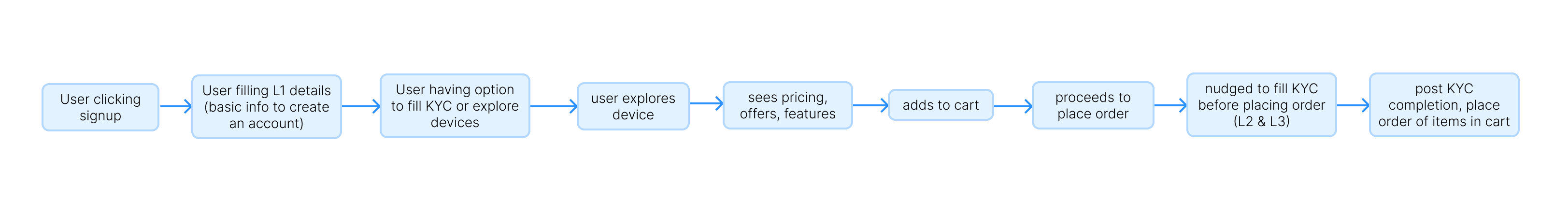
Solution & Wireframes
The new journey was divided into three sub-journeys:
01
Signup & KYC
02
Exploring Catalog & Device Ordering
03
Post Order Experience
Signup & KYC: Onboarding the users
Razorpay’s unified payment journey is extensive, so the challenge was to introduce offline & omni payment KYC without overwhelming users or losing their motivation.
Our Vision: The Ideal Experience
A seamless e-commerce-like flow where users explore the POS catalog, features, and pricing before signing up:
MVP Journey (Prioritizing Business Risk)
Due to regulations and business risk, POS sales were restricted to post-signup until the self-serve model was validated, preventing drop-offs during exploration. This was done to safeguard huge business that came from online payments
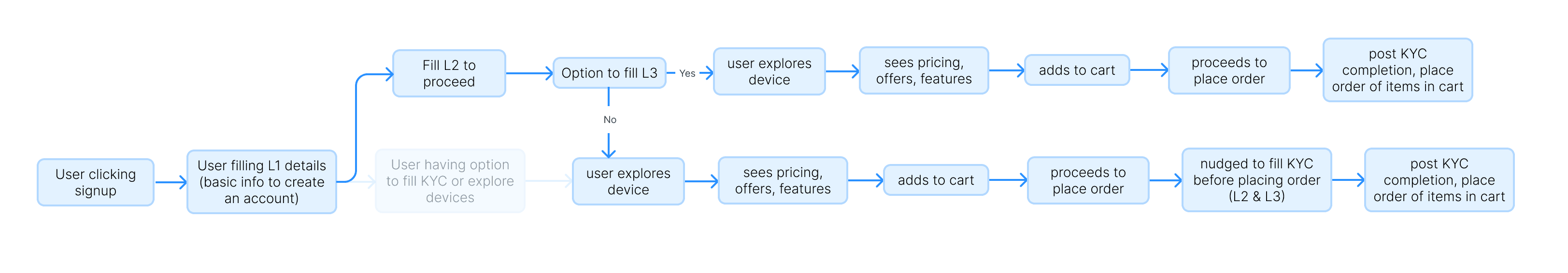
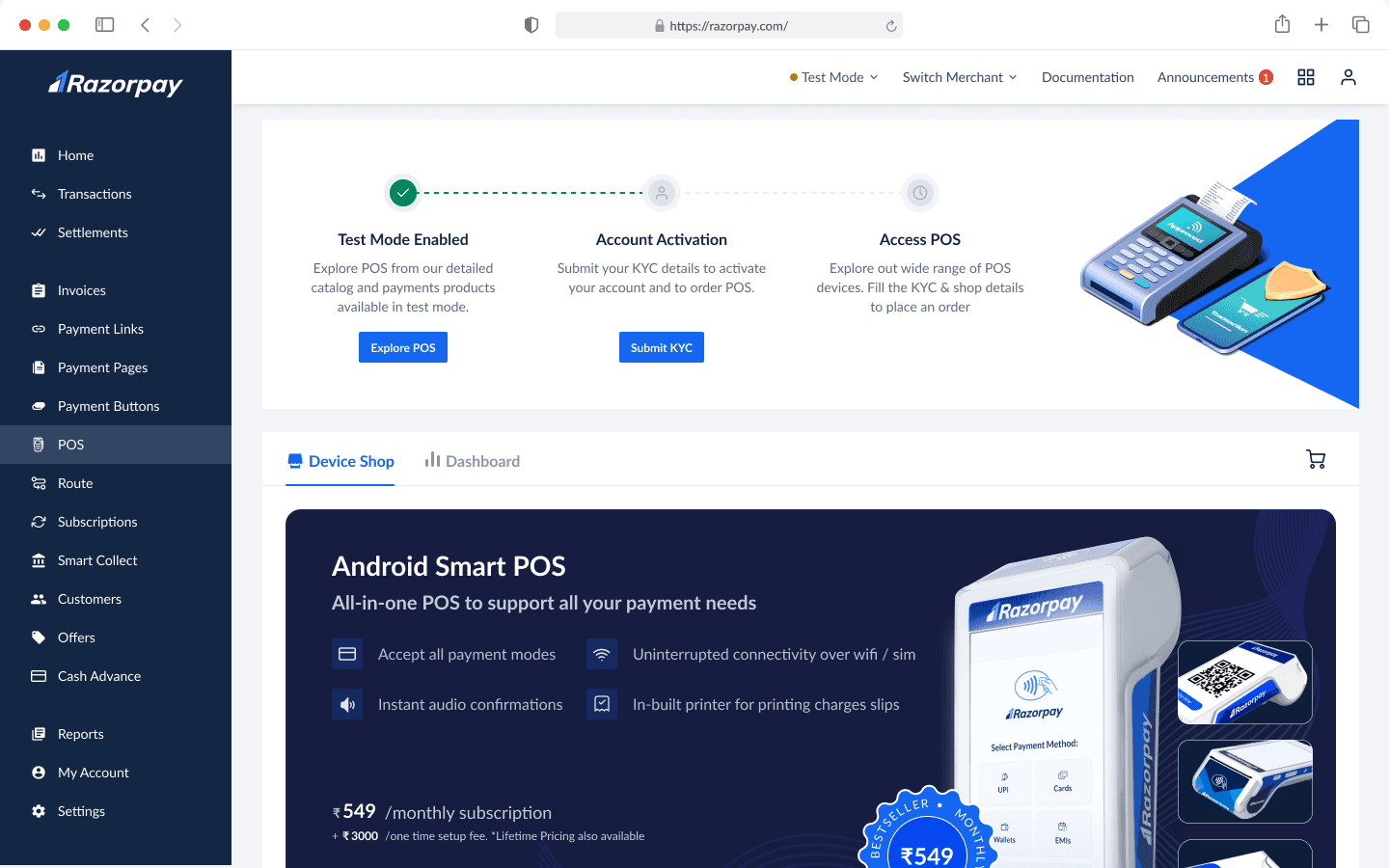
Exploring Catalog & Device Selection
Previously, merchants had to wait for Risk team approval before even viewing POS devices, leading to drop-offs and lost conversions. Competitors’ door-to-door sales teams quickly closed deals, making recency bias critical.
Design Decisions that were made
Immediate product exploration after signup, leveraging high motivation.
Self-serve catalog replaces manual sales teams, allowing users to explore and compare POS options.
Parallelizing risk assessment & order placement to shorten delays. If a merchant fails risk approval post-order, the order is canceled from our end.
Transparent progress tracking to keep motivation intact.
Strong value proposition messaging design to justify higher-priced POS devices vs. competitors.
Guided decision-making to help users choose the best device for their needs.

Visible use cases with every device
Easy to switch between catalog & dashboard
Too long of a page to display complete information
Visible use cases with every device
Easy to switch between catalog & dashboard
Top devices are getting immediate notice in the first fold itself
No information hierarchy between the devices as required by business problem statement
Visible use cases with every device
Easy to switch between catalog & dashboard
More information realstate for each device
The other devices are getting hidden in the carousal
Post Order Journey
Since 16.5 days is a long wait, post-order communication was crucial to:
Provide real-time updates on device status.
Handle Risk team follow-ups for additional document submissions (NC Flow). Orders held due to missing documents needed clear communication to merchants.
This redesigned journey improved transparency, reduced drop-offs, and enhanced the merchant experience.
Solution: Product Discovery
Goal of the journey
⏱️ Reduce wait time for sales to send device brochure and call users
👀 Increase visibility of our vast catalog of devices
🔍 Increase discoverability of our device catalog for experienced and new users
🛍️ Provide real world experience to help users make a decision
⭐️ Communicate importance of bestseller device.

Solution: Product Decision
Goal of the journey
🛍️ Create similar shopping experience as offline
🧭 Guide/help users to make a decision
🚪 Give easy exit or checkout opportunity at all times
📋 Provide all documentation and information acting as self serve support

UI Design: Communications
Once an order is placed, keeping users updated is crucial, especially with a 16.5-day delivery timeline. Since orders proceed without immediate Risk approval, some may require document resubmission (NC flow). To manage this, we set up communications for order status and hold scenarios.
Communication & status during the process
These comms served two purposes:
To give status of their application & next steps
Give CTA if there's a action blocked on users' end.
We created detailed communication states that covered all the use cases from starting signup to device getting delivered to user's doorstep.


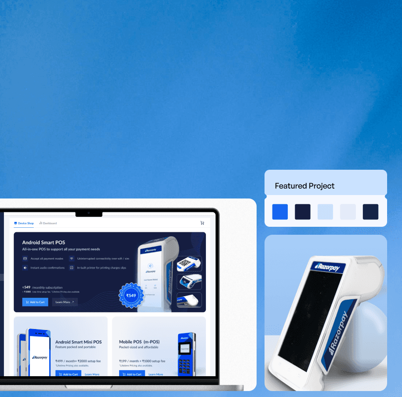
FINAL OUTPUT
We launched this project in Dec 2023 in phase wise manner, first in metro cities and then PAN India. This project increased our online channel sales by 200% and still going strong.
Footnotes & Iterations
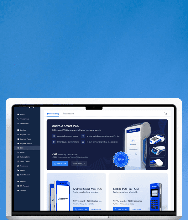
UI Design: Product Catalog
The catalog aimed to give user directional information to help users make quick, high-intent purchase decisions while highlighting our best-seller as the all-in-one solution. Here's how we designed it.
Primary Card Variations

V1
All the angles of the device are visible
No guidance for user to choose this device
Too much empty space

V2
Key information availble to support decision making
All device angles shown but are relying on users' prior knowledge of products
Pricing & CTA are getting low visual importance

V3
All the angles of the device are visible
Not enough information to support decision making
Too much empty space
Modern for Razorpay’s current design language

V4
Better hierarchy of CTA
All device angles shown but are relying on users' prior knowledge of products
The hierarchy of RTB pointers and CTAs are not clear
Pricing is not prioritised

V5
Pricing is gaining importance.
The device screen effectively displays a wide variety of payment methods available
Some device angles are visible & conveying meaning.
The hierarchy of RTB pointers vs CTAs and pricing are not clear
The pricing could be overwhelming at lifetime amount

MVP
Better hierarchy of CTA
Pricing is gaining importance.
The device screen showcases diverse payment methods, using realstate judiciously
All device angles shown but are relying on users' prior knowledge of products
RTBs & CTA are having equal importance
The pricing could be overwhelming at lifetime amount

FINAL
Pricing is getting good importance.
The device screen showcases diverse payment methods, using realstate judiciously
Device angles are conveying features of the device
The RTBs are visually above on hierarchy but CTA is more noticeable
Secondary Card Variations

V1
The device is getting highlighted properly
Pricing is not getting enough importance
No space for RTBs to guie user decisions
Pricing lacks detail for informed user decisions.

V2
The device is getting highlighted properly
Well highlighted RTBs guiding user decisions
Device hierarchy established between more popular vs less popular devices
Copy guiding most suitable use case of the product: store, delivery etc.
Pricing is not getting enough importance
Pricing lacks detail for informed user decisions.
Different size cards are not scalable.

V3
The device is getting highlighted properly
Well highlighted RTBs guiding user decisions
Highlighted use case with heading
Pricing is getting better visibility in light mode
Device hierarchy established between more popular vs less popular devices
Layout is little modern as per Razorpay’s current brand
Picing is singular, could be more detailed to guide users
Different size cards are not scalable.

V4
The device is getting highlighted properly
Well highlighted RTBs guiding user decisions
Highlighted use case with heading
Pricing is getting better visibility in light mode
Elaborate pricing guiding user better
Device hierarchy established between more popular vs less popular devices
The card sizing is big to be visible in single scroll
Different size cards are not scalable.

FINAL
Cards are uniform and scalable
The device is getting highlighted properly
Well highlighted RTBs guiding user decisions
Highlighted use case with heading
Pricing is getting better visibility in light mode
Elaborate pricing guiding user better
Easy Support & Help


since our users are used to human interaction for device purchasing, we wanted to let our users know that even if we have created a self serve flow, we still have customer support to assist you.
So first we tried to tell them that this self serve process is pretty easy to execute by showing it in three simple steps.
Then on the second scroll, we show them that they can reach out to us we can help them find a device of perfect for them.
Catalog: Final Version
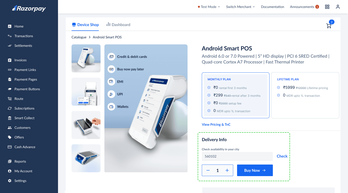
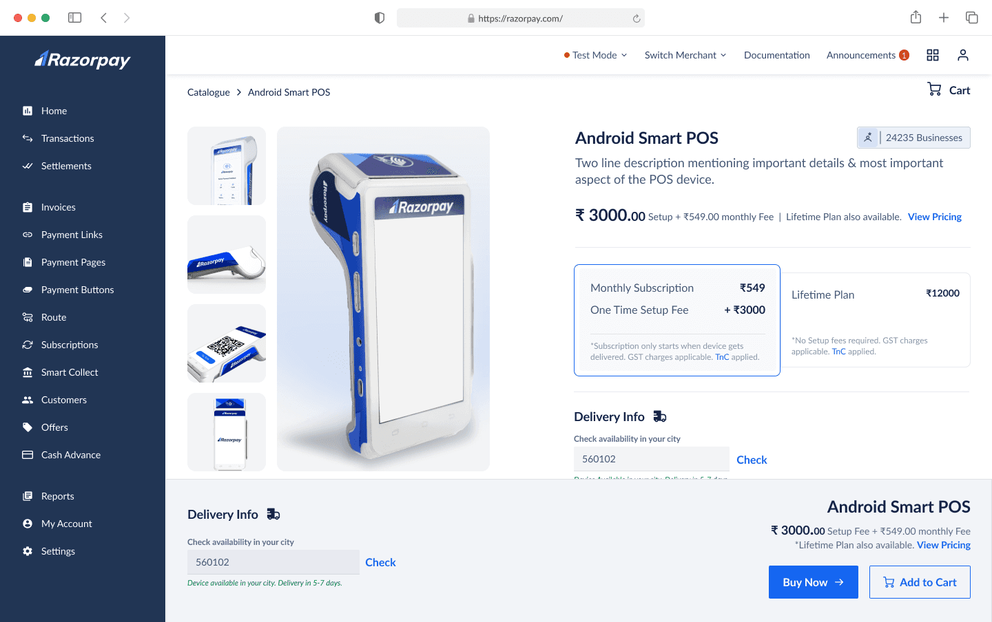
UI Design: Product Descrption Page
Once user explores the catalogs and chooses a device, they can explore more about a device through a detailed product description page. The product description page should do following jobs:
Give elaborate angles of the product
Give easy access to pricing information which has 2 options
Give RTBs to help users make the decision
Give easy access to technical specification for users go deep in the details
Give users comparison between the devices to help them make better decision.
Access to CTA at all points
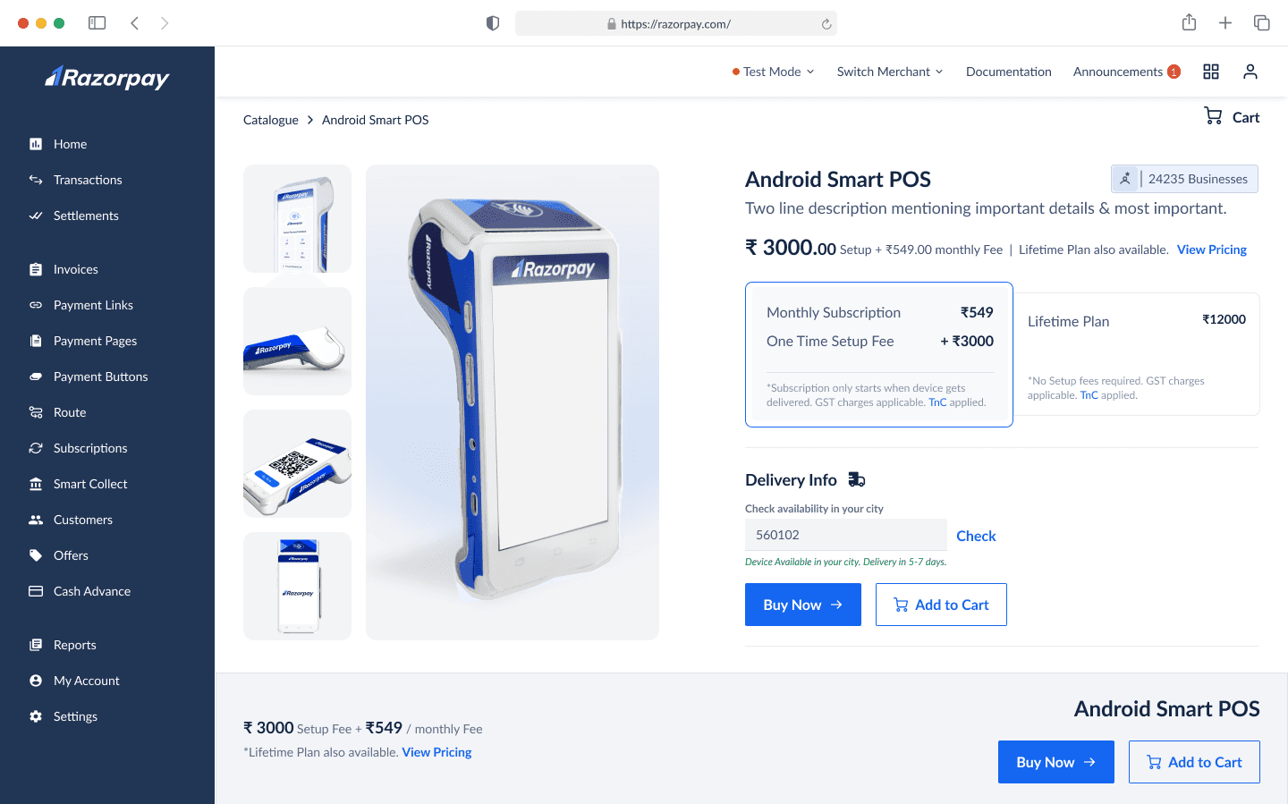
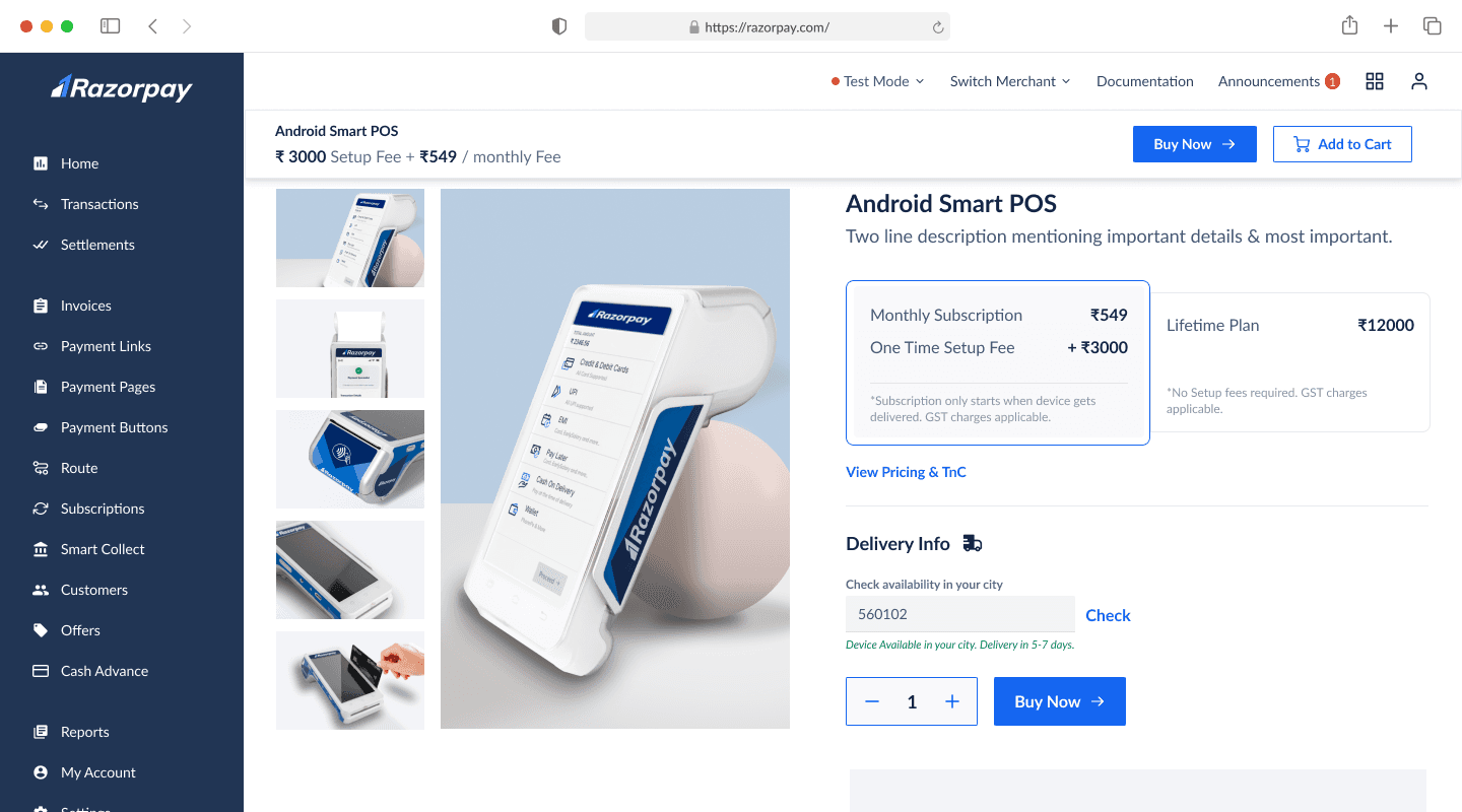
Detailed Pricing Variations

V1
Primary Pricing is getting good highlight
Extra step needed for pricing details
User has to perform one extra step to select pricing

V2
Primary Pricing is getting good highlight
Default plan preselected; action needed for changes.
User gets to see breakdown of pricing upfront
No common CTA for unified TnC
Blue price text feels like a link

V3
Primary Pricing is getting good highlight
Default plan preselected; action needed for changes.
User gets to see breakdown of pricing upfront
The pricing is a toggle is more prominent visibly
No common CTA for unified TnC

V4
Primary Pricing is getting good highlight
Default plan preselected; action needed for changes.
User gets to see breakdown of pricing upfront
The pricing is a toggle is more prominent visibly
Common & more prominent CTA for detailed pricing & TnC
Final: Pricing
Device Comparison Table Variations

V1
Cluttered layout due to icons, center-aligned text, and strikethroughs for unavailable items.
Repeating "View All" CTAs in all three columns felt redundant, as expanding them together provided full context.
‘Hide’ CTA placement as a universal CTA in this section is not noticeable
User has to perform an extra step to view pricing

V2
Pricing is visible and doesn’t require any action
Universal “view all” & “show less” CTA drawing better focus
Cluttered layout due to icons, aligned text, and strikethroughs for unavailable items.
Icons are repetitive in every column & while they are comprehensive, still can be mistaken

FINAL
Legends give more meaning to icons & reduce repetitiveness of icons on each column
Ticks & crosses are making layout look cleaner & ang give clearer comparission
Pricing is visible and doesn’t require any action
Universal “view all” & “show less” CTA drawing better focus
Page Structure, UI & RTBs
V1
Too long of the scroll to understand full infortmation
Too much text adding cognitive load
V2
The features are getting good visibility & disctinction
Too long of the scroll to understand full infortmation
Too much text adding cognitive load
V3
The features are getting good visibility & disctinction
Images are conveying meaning visually hence being more engaging and convincing
Too long of the scroll to understand full infortmation
V4
The features are getting good visibility & disctinction
Images are conveying meaning visually hence being more engaging and convincing
Too long of the scroll to understand full infortmation
V5
The features are getting good visibility & disctinction
Images are conveying meaning visually hence being more engaging and convincing
RTBs & physical feature highlights are getting mixed up
V6
The features are getting good visibility & disctinction
Images are conveying meaning visually hence being more engaging and convincing
RTBs & physical feature highlights are getting good distinction
3 card layout have less space to explain features
Final
The features are getting good visibility & disctinction
Images are conveying meaning visually hence being more engaging and convincing
RTBs & physical feature highlights are getting good distinction
Decent real-state to every feature and card
Longer scroll but engaging
Additional Screens
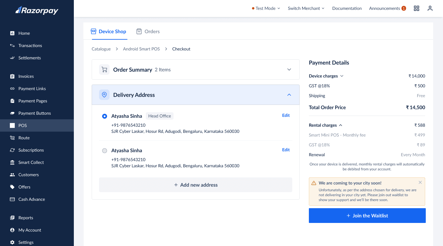
Launching in metro cities for MVP
For the MVP launch, we targeted metro cities, not PAN India. To inform users and retain them, we added an input field to let them check device availability in their city along with message of sooner launch.
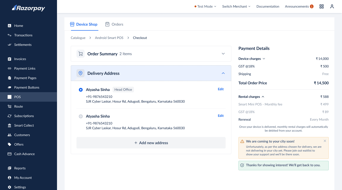
Join the waitlist for non-GTM cities
Even after checking the PIN code, users can proceed to the cart. At the delivery address step, we implemented two checks:
The default address from the KYC log is pre-filled. If delivery isn’t available, users see a message with a CTA to join the waitlist, helping us gauge demand.
Users can add a new address, but if it doesn’t match the merchant’s documents, they must complete a clarification process.
This ensured we didn’t receive orders from non-GTM cities.
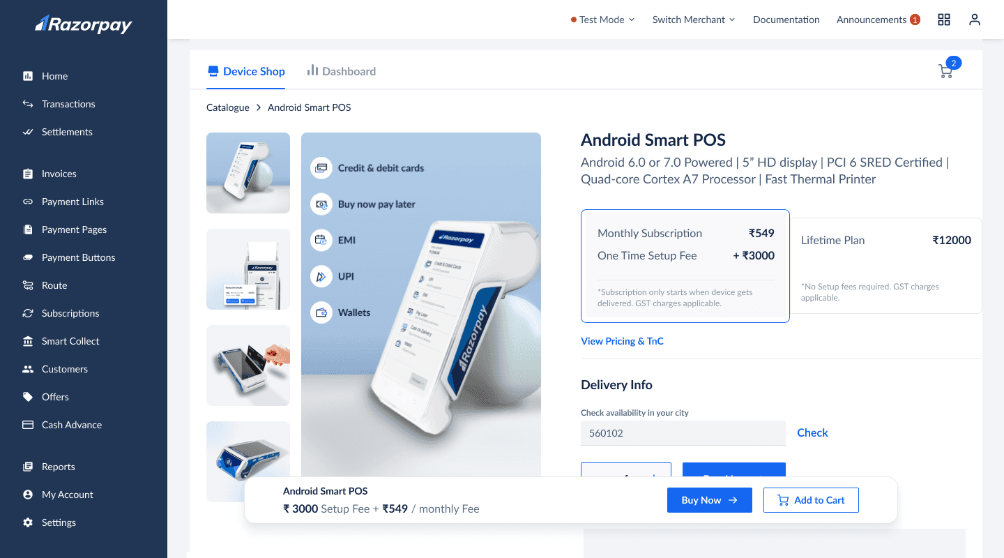
Sticky signup for higher conversion
We created a detailed product page for users to explore our offering. To ensure easy access to the CTA at any point of purchase intent, we added a sticky bar with the CTA, inspired by best practices from e-commerce players.
V1
CTA is easily accessible
User can check availability in their city
Excess information
Sticky banner too large, limiting viewport height
Sticky left navbar, topbar, and banner block three sides, feels restrictive
V2
CTA is easily accessible
Sticky banner too large, limiting viewport height
Sticky left navbar, topbar, and banner block three sides, feels restrictive
V3
CTA is easily accessible
Only two sides of the page is blocked by navbars
Size of the navbar is apt
Top placement boosts attention but limits visibility.
vieport height still feels reduced
FINAL
Floating navbar appearing post 2nd fold and is not end to end
Float placement is bringing better attention
CTA is easily accessible
Only two sides of the page is blocked by navbars
Size of the navbar is apt
Some UI Iterations: Product Cards
Different card iterations highlighting the functions such as-
Adding CTAs of print receipt and send e-receipt showing multi-functions. Payment successful message giving a sense of success to users
Adding definitions of the functions along with different angular images of the device.
Adding technical specifications highlighting elements of the device.