My Role
Product Designer
Services
Dashboard Design
Timeline
6 weeks
Scope
Research, Design & Usability Testing
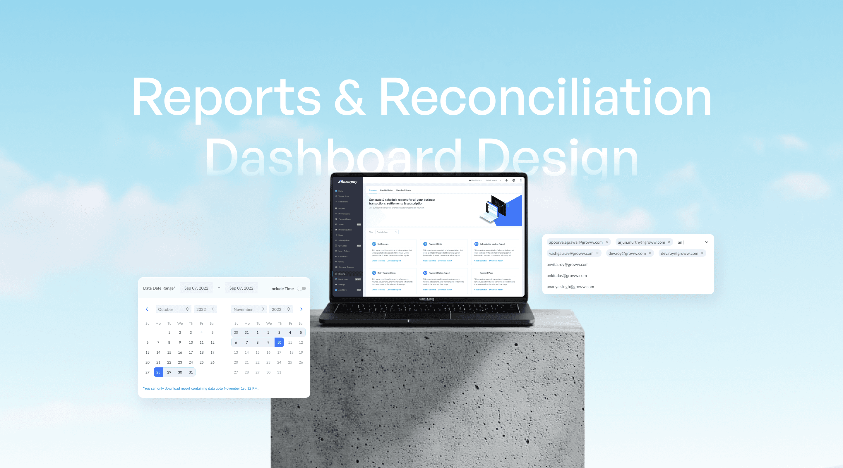
The transaction of money always require careful reconciliation. The self serve reporting & scheduling is designed to increase visibility of transactions for users. Giving them more control of their transaction data and reconciliation. Through this project users can download different types of reports at any time, present or past and set up schedules for the future ensuring all-time access without dependency.
Merchants using the Razorpay dashboard frequently downloaded transaction reports—some daily, others multiple times a day—for reconciliation. Larger firms relied on Razorpay’s engineering team to manually create report schedules, but modifying these schedules required merchants to go through a lengthy approval process.
There was a clear need for a self-serve solution that allowed merchants to automate report deliveries via email, SFTP, or S3 without depending on customer support.
High demand: Report schedule requests grew 90% YoY, from 362 in 2020 to 658 in 2021, with 65 new requests per month in 2022 (as of May).
Slow turnaround: Any change in schedules required merchant support intervention, with an end-to-end TAT of up to 5-7 days.
Poor visibility: Merchants had no way to view or manage existing schedules on the dashboard.
This created friction, delays, and a frustrating experience, making automation and self-service essential.
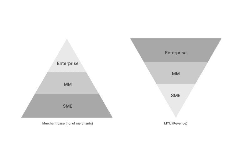
If we try to understand Razorpay's user base and their contribution to business, the presentation would look like these triangles.
Razorpay had a large base of Small businesses, followed by Mid-Size businesses and lastly least in number enterprise business. While the contribution to business is inverted.
Keeping this in mind, we can concur that it was important for Razorpay to have schedules for enterprise's requirement and we need to have easy user experience for large based (majority) SME users.
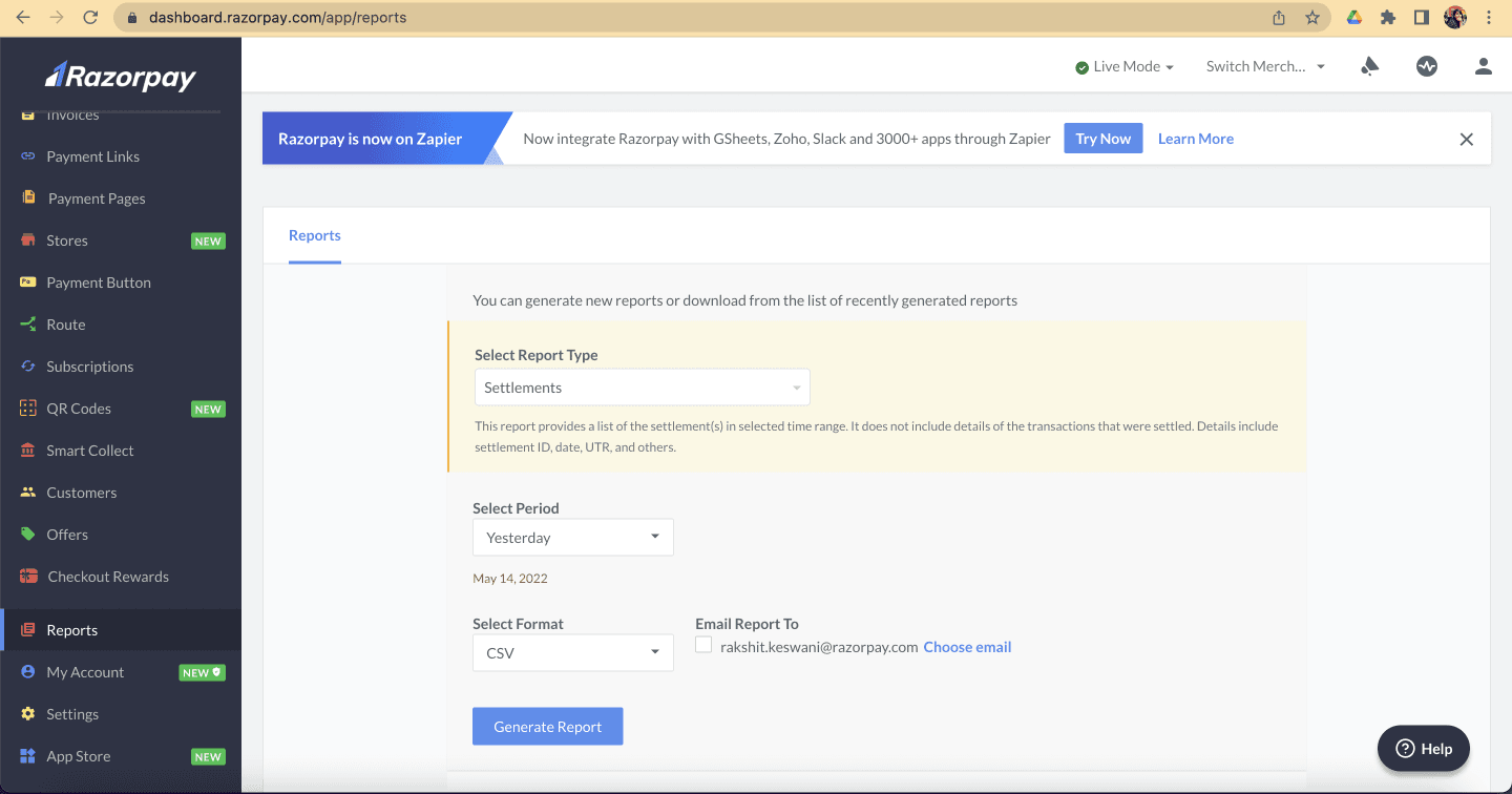
The old information architecture had history and capability to download report in a single view, making it a long scroll. Also it left no scope to add more capabilities in the view.

With expansion of reporting as a product, we needed a more flexible dashboard with clearer sections. Current dashboard had a single view ‘Reports’ which was divided in two parts: new download, and previously downloaded.
In the new setup, we needed to introduce new schedules and running schedules. We decided to divide sections to avoid long scroll and overwhelm.


Modal experience was chosen for a schedule creation journey.
Reason behind this UX decision:
Schedule creation/edit is a one-time/rare action user needed to perform.
This action required an undivided attention & un-interrupted experience from the user.
Being a multi-step journey, following a no-modal approach would have led to multiple page navigations within dashboard.


Created a cleaner version of the original approach.
Designed a flowing layout to reduce excessive eye movement, ensuring users find information intuitively.
User Testing:
Observed users filling fields in various orders, leading to confusion.
Custom sections required users to perform actions in a specific sequence.

Designed with progressive content delivery to avoid overwhelming users with information all at once.
Adopted a sequential approach to guide users clearly on which fields to fill first.
User Testing Insights:
Despite sequential content, users still filled fields randomly due to visibility of all fields at once.

Based on user testing feedback, we identified two key insights:
Users needed guidance on the order of filling details, as some fields depended on others.
Custom sections weren't relevant for all users, so they should be optional and accessible only when needed.
Our refined approach divided the form into three clear sections: What (report details), When (report schedule), and Who (report recipients).
Implemented a sequential flow, requiring users to fill details in the given section order, ensuring clarity and simplicity.
Outcome: We tested iteration 03 with our internal users, account managers and this faired well with them. Hence we decided to go ahead with this.

This sections forms the foundation of the schedule. Letting the users choose the type and give schedule a name.
Product Selection: User selects the product they need information about.
Format: Chooses report format (Excel or CSV).
Naming: Assigns a custom name (e.g., "Afternoon Reconciliation," "Weekly Schedule").

Once the basic details about what the reports are about, schedule setup is to be done.
Now in the above section as we saw in user testing, we saw 50% of the enterprise users needed customisation and minute modifications while rest 50% didn’t need custom at all. SME and MM also didn’t need customisation.
Hence we decided to make the “custom” scheduling OFF as default and allowed users to switch it on when they want as a friction step.
So the flow looked something like this:
Start Date:
Users select the schedule start date; defaults to today if unspecified.
Data & Duration: Users specify:
Duration of data (e.g., "1 week of data").
Frequency (e.g., "weekly").
Universal frequency options (daily, weekly, etc.) are standardized.
Default logic:
Selecting a duration auto-sets and locks frequency.
(e.g., "1 week of data" defaults frequency to "weekly.")To edit frequency differently, users must select "Custom" scheduling.
Delivery Time: Users specify report delivery time.
Custom Toggle:
When enabled, allows flexible duration options such as past 2 days, 3 days, weekly, 15 days, month, or past quarter.

Initially, only dropdown functionality was provided to select recipients.
User Testing Insight: Some organizations had 50-100 team members, creating a long, cumbersome dropdown.
Solution: Added search functionality within the dropdown for improved usability.
The product and business teams aimed to let users create recurring schedules for reports. The ideal scenarios included receiving daily reports with past 24-hour data, weekly reports with past week’s data, and similarly monthly, quarterly, and yearly reports. Additionally, the business team required allowing flexibility, such as receiving a daily report with past 3 days of data, which would cause repetitive data on the 2nd and 3rd day.
Initially, all scheduling fields (e.g., Duration Covered and Repetition Frequency) were combined into a single, complex grid structure. To clarify:
Duration Covered: Range of data included in the report (e.g., past week's data).
Frequency: How often the report repeats (e.g., daily, weekly).

Lack of Initial User Research:
Without upfront research, it was challenging to justify simplifying these complex customization options. Product team relied on enterprise user data, advocating for detailed customization.Product Team's Logic:
Claimed enterprise customers frequently requested detailed customization. But I believed this data was skewed toward large enterprises, neglecting the 95% of SME & mid-market users.My Hypothesis: Excessive customization would confuse most users (SMEs & MM). Proposed keeping customization backend-managed for few enterprises, preserving a simple experience for majority users.
Trade-off Decision:
Faced a trade-off between:Ensuring excellent user experience for majority users
Providing extensive functionality for large enterprises
Conclusion:
As the product team was the final decision-maker, we agreed to conduct usability testing to validate my hypothesis vs. their requirements.
Usability Testing Round 01 revealed:
Users found Duration and Frequency extremely confusing.
Grid structure with overlapping fields like “repeat on” dropdown caused redundancy and complexity.
Initial approach was inspired by Google Calendar, allowing complex customizations (e.g., select specific days for weekly reports or specific dates for monthly reports).
In the new approach, custom was made default OFF, adding friction for SME
Data duration and repetition were made co-dependent. While users can choose which field to fill first, the other field will automatically be filled with right option and would not be editable.
Example: If user selects Data duration as 24hours or 2 days or 3 days, the repetition will automatically be set to “daily” and won’t be changeable. Similarly for duration: past week, repetition would be set to weekly.
The only change one could do is to choose the day of the week on which they would get the report


With the launch of self serve reporting, we also launched a banner on the dashboard to publicize it to SME merchants.
We saw an overall increase in schedules by 108%, almost more than double in number. This is data of 4 months. 3000 schedules in 4 months.
Reduce in number of tickets by 83%
Since this was one of my first projects, I started with product requirements. And after considerable development, I realised that some of requirements were micro optimizations. It took multiple rounds of usability to convince product and business and also to gain confidence in the current state of project. In any project, any kind of usability testing is good and necessary. It can save a lot of time.